Boston’s public schools have adopted a new, more accurate world map
By David Leveille
PRI
Boston’s public schools have adopted new world maps for some of their classrooms.
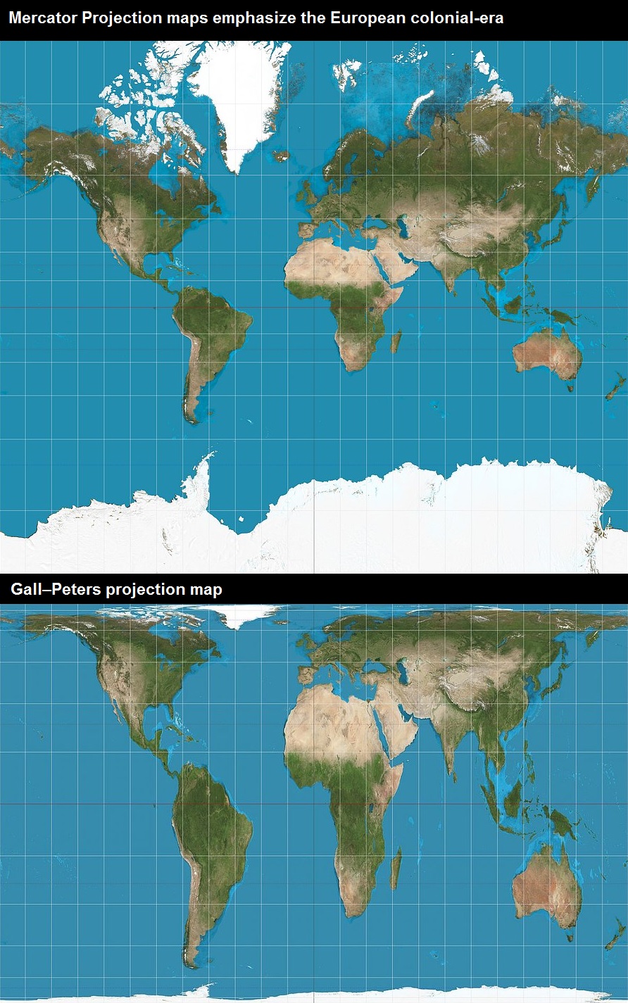
The new maps replace the traditional, rectangular maps made using the 16th-century Mercator Projection method that was introduced back when Europe ruled — and exploited — much of the world. Mercator world maps emphasize the colonial-era Atlantic Ocean trade routes and distort the relative sizes of continents.
Other distortions inherent in the Mercator Projection display a kind of territorial superiority. Simply put, predominantly-white countries are huge seeming, while nonwhite-majority countries are rather small, in comparison.
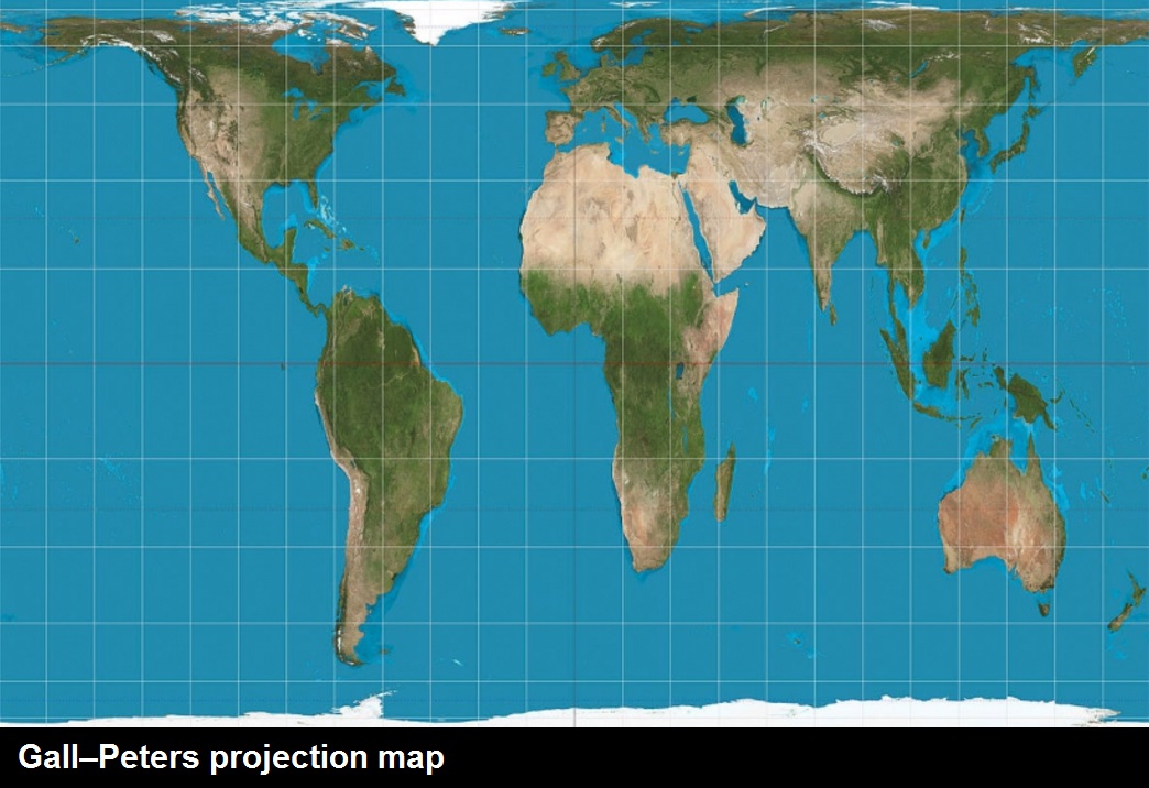
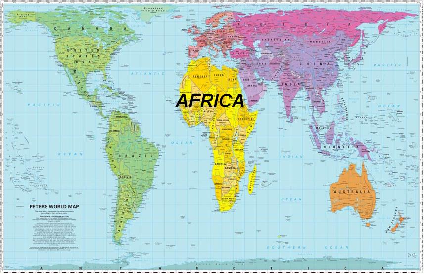
Social studies classrooms in Boston are now getting maps drawn using the Gall-Peters Projection.
In other words, these maps show countries, continents and oceans according to their actual size and location.
The most glaring distortion on the Mercator map, says Frederick-Clarke, is the size of Africa. “Greenland looks about the same size as Africa, the United States looks like it’s comparable in size, and we know that is absolutely not true.
Frederick-Clarke says Boston social studies teachers now have a map that better reflects the reality, and in turn, the diverse student body.
Listen to audio
___
Video: How Western European countries downplay size of Africa
___
Video: Boston schools to replace classic world map
___


March 24, 2017
Did you know?, Educational